9 Data Visualisation
9.1 Creating publication quality graphics
Once you’ve completed your data analysis you’re going to need to summarise it in some really nice figures for publication and/or presentations. This is where R can really shine in comparison to something like Excel.
While you can create plots through various, including base R, the most popular method of producing fancy figures is with the ggplot2 package. First things first, if you haven’t done so yet, we need to install the ggplot2 package:
install.packages("ggplot2")And load the package:
library(ggplot2)9.2 Grammar of Graphics
ggplot2 is built on the grammar of graphics concept: the idea that any plot can be expressed from the same set of components:
- A data set
- A coordinate system
- A set of geoms - the visual representation of data points
The key to understanding ggplot2 is thinking about a figure in layers.
To start with we need to create the base layer for our plot. This is done with the ggplot() function, and it is here we define are data and coordinate system components. We set our data compnent using the data argument, and then use the aesthetic function aes() as a second argument to define our coordinate system. The aes() function can potentially be used multiple times when constructing our figure, so it is important to know that anything defined inside the base ggplot() function is a global options inherited by all subsequent layers.
Time for an example:
ggplot(data = titanic_clean,
       aes(x = Age,
           y = Fare))
Here we have said that titanic_clean is our data component, and to use Age on the x-axis and Fare on the y-axis for our coordinate system.
Now lets build onto this base layer by adding geoms to represent our data! ggplot2 employs a really nice syntax where you can add subsequent layers using the + operator. This lets R know that the plot isn’t finished yet and to add the new layer on top. In this case, we want to represent our data as a scatterplot so we use the geom_point() function.
ggplot(data = titanic_clean,
       aes(x = Age,
           y = Fare)) +
  geom_point()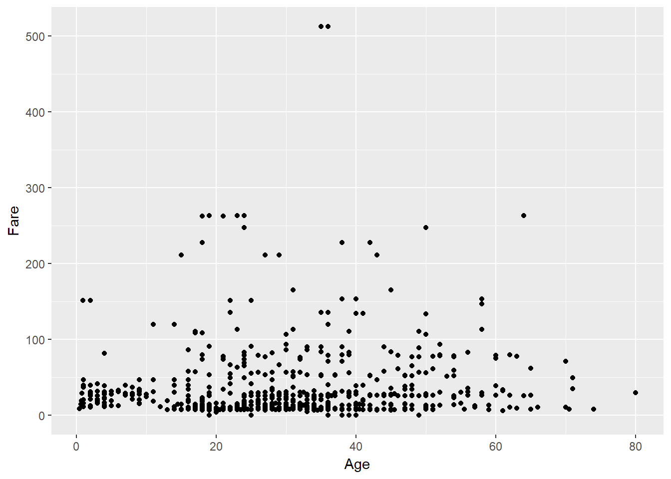
This plot isn’t really telling us much! There are potentially confounding variables in play. What if we want to see the effect of another variable on the Fare ~ Age relationship? We can tell R to colour our points based on a third variable by setting the col argument in our global aes() call. Lets see what effect passenger class has:
ggplot(data = titanic_clean,
       aes(x = Age,
           y = Fare,
           col = as.factor(Pclass))) +
  geom_point()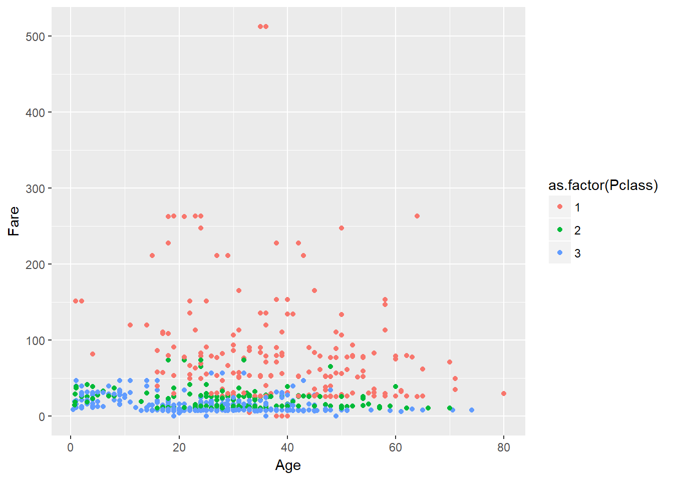
We have used the as.factor() function on Pclass to ensure it is considered a discrete variable and not continuous for the colour scheme.
Now we can start to tease apart some trends from the data.
9.3 Layers
Instead of a scatterplot We could also make a line plot. This time we will use geom_line() instead of geom_point().
ggplot(data = titanic_clean,
       aes(x = Age,
           y = Fare,
           col = as.factor(Pclass))) +
  geom_line()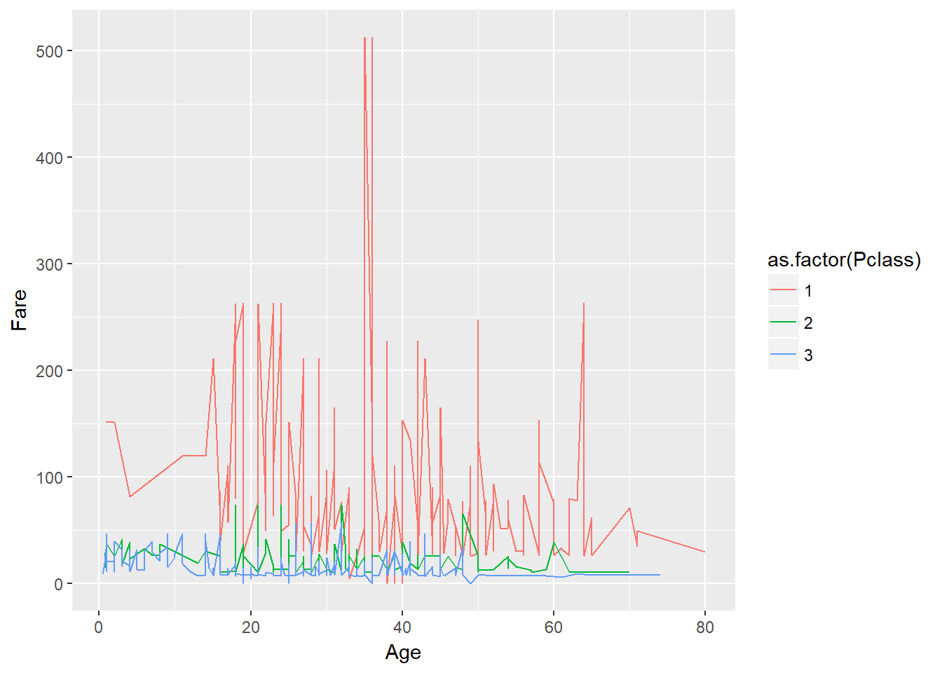
But what if we want to visualise both lines and points on the plot? We can simply add another layer to the plot:
ggplot(data = titanic_clean,
       aes(x = Age,
           y = Fare,
           col = as.factor(Pclass))) +
  geom_point() +
  geom_line()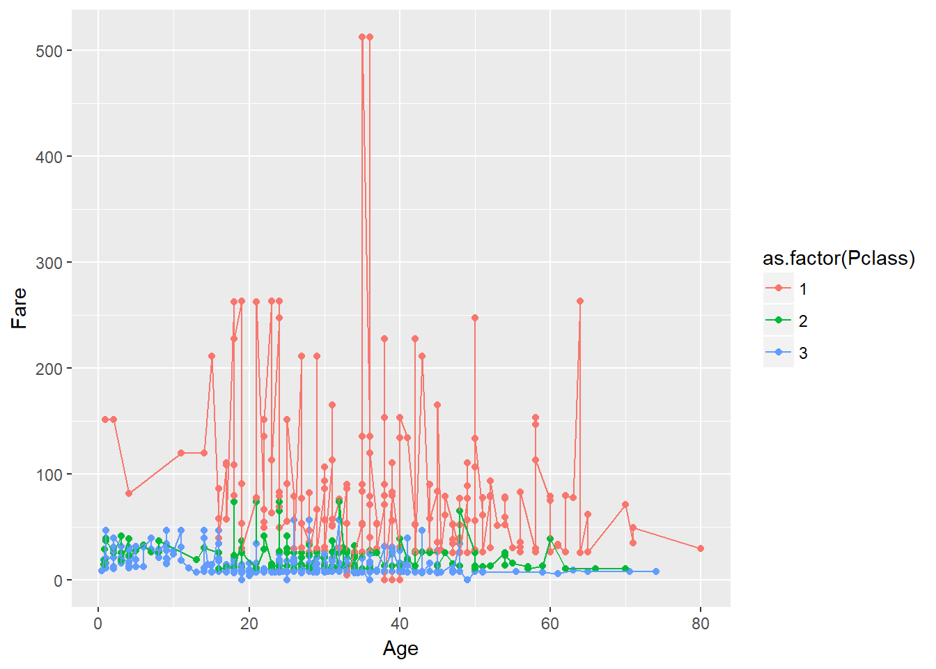
It’s important to note that each layer is drawn on top of the previous layer. In this example, the lines have been drawn on top of the points. Here’s a demonstration:
ggplot(data = titanic_clean,
       aes(x = Age,
           y = Fare,
           col = as.factor(Pclass))) +
  geom_point(col="black") +
  geom_line()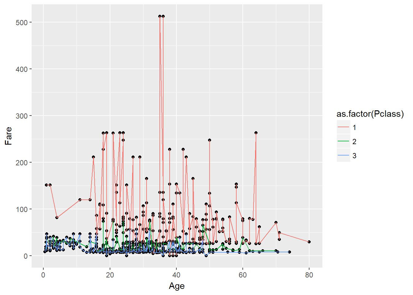
####################
### Challenge 17 ###
####################

# Switch the order of the point and line layers from the previous example. What happened?
9.4 Transformations and statistics
ggplot2 also makes it easy to overlay statistical models over the data. To demonstrate we’ll go back to our first example:
ggplot(data = titanic_clean,
       aes(x = Age,
           y = Fare,
           col = as.factor(Pclass))) +
  geom_point()
We can fit a simple relationship to the data by adding another layer using geom_smooth(). We need to specify the method for modelling the relationship so lets use lm for a linear model.
ggplot(data = titanic_clean,
       aes(x = Age,
           y = Fare,
           col = as.factor(Pclass))) +
  geom_point() +
  geom_smooth(method = "lm")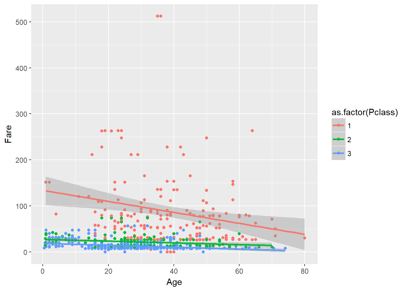
Now we have plotted some linear models and their confidence intervals to show the relationships between Fare and Age for each Pclass, but it is hard to tell second and third class apart. To better view these relationships we can transform the y-axis to make it clearer. ggplot2 has a variety of scaling functions that can be implemented, but in this case we want to log scale the y axis:
ggplot(data = titanic_clean,
       aes(x = Age,
           y = Fare,
           col = as.factor(Pclass))) +
  geom_point() +
  geom_smooth(method = "lm") +
  scale_y_log10()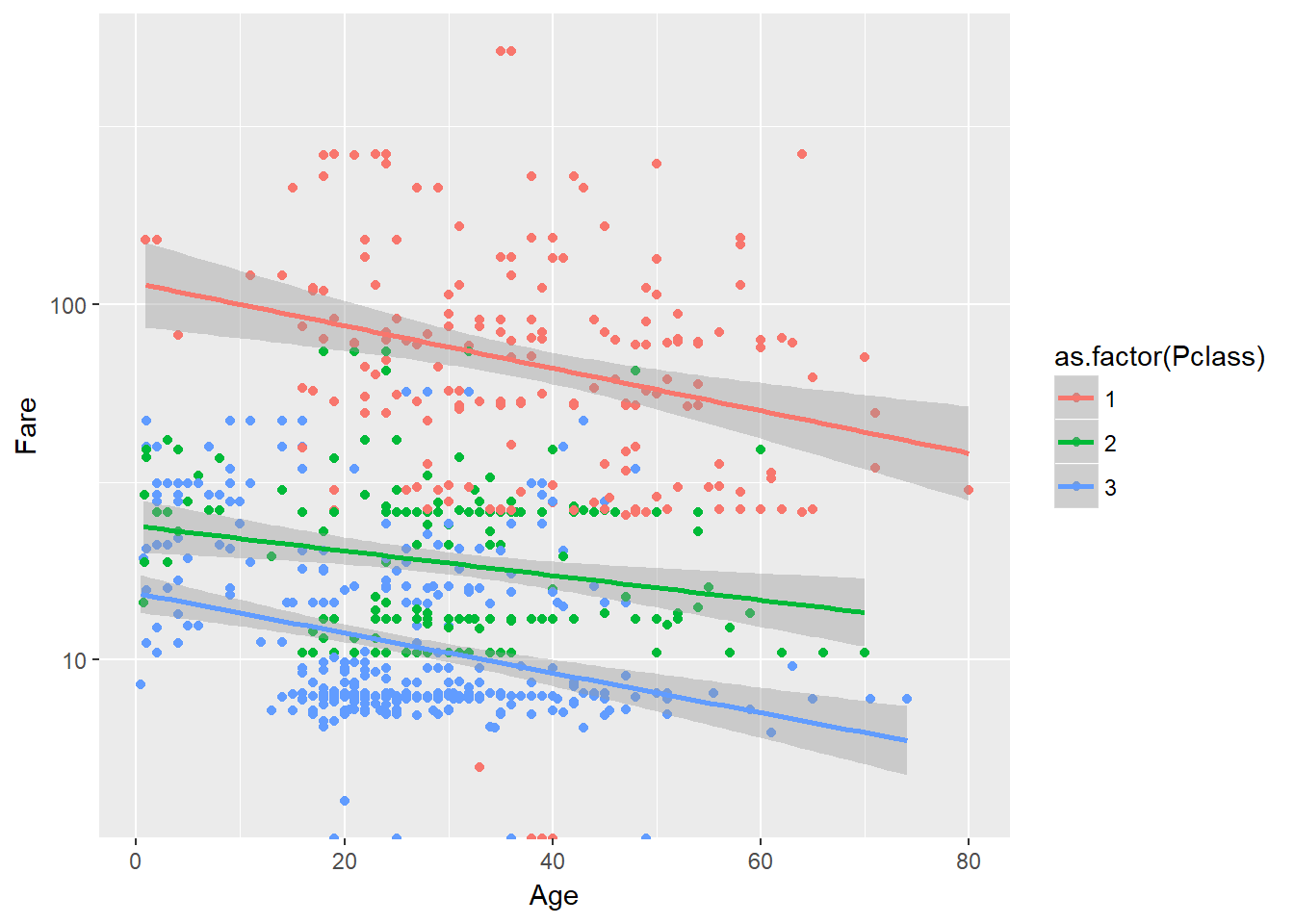
Now we’re at the point where we have a layer of the graph whose aesthetic characteristics are partially independent of the other layers: geom_smooth(). It has inherited the global options set by aes() in the ggplot() layer, but we can also change local options that only apply to the aesthetics of this layer. Depending on the layer in question these local options may be controlled with another aes() function and/or just with arguments to the function.
####################
### Challenge 18 ###
####################

# Using the following base code:

# ggplot(data = titanic_clean,
#        aes(x = Age,
#            y = Fare,
#            col = as.factor(Pclass))) +
#   geom_point() +
#   geom_smooth(method = "lm") +
#   scale_y_log10()

# Experiment with the additional options you can use to customise the `geom_oint()` and `geom_smooth()` layer. There is no set challenge, just experiment with different options. Consider changing the point/line size, transparency, linetype, etc.
9.5 Multi-panel figures
So far we have visualised the relationships between variables in a single plot. Alternatively, we can split out different groups in the data into multiple panels by adding a layer of facet panels. The facet_grid() and facet_wrap() layers do this wit slightly different amounts of control, but for now we can stick with facet_grid(). We need to specify which variable we want to split the plots by by supplying it as a formula like ~variable_name.
This time lets look at the relationship Sex and Survived as a bar plot using geom_bar() (the position = dodge argument means have them side by side not stacked). First as a single plot:
ggplot(data = titanic_clean,
       aes(x = Sex,
           fill = as.factor(Survived))) +
  geom_bar(position = "dodge")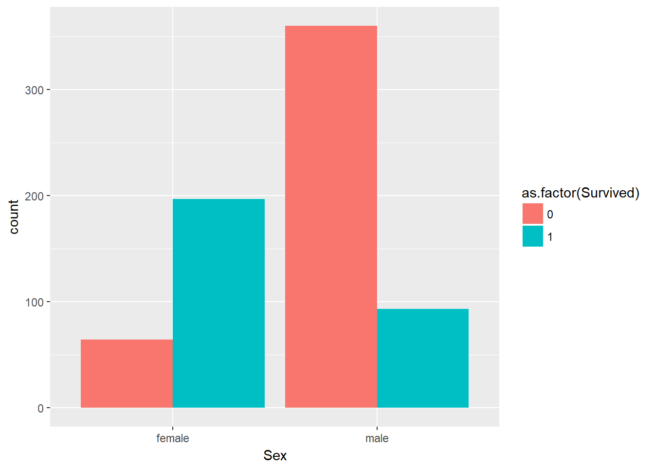
And now facetted by passenger class:
ggplot(data = titanic_clean,
       aes(x = Sex,
           fill = as.factor(Survived))) +
  geom_bar(position = "dodge") +
  facet_grid(~ Pclass)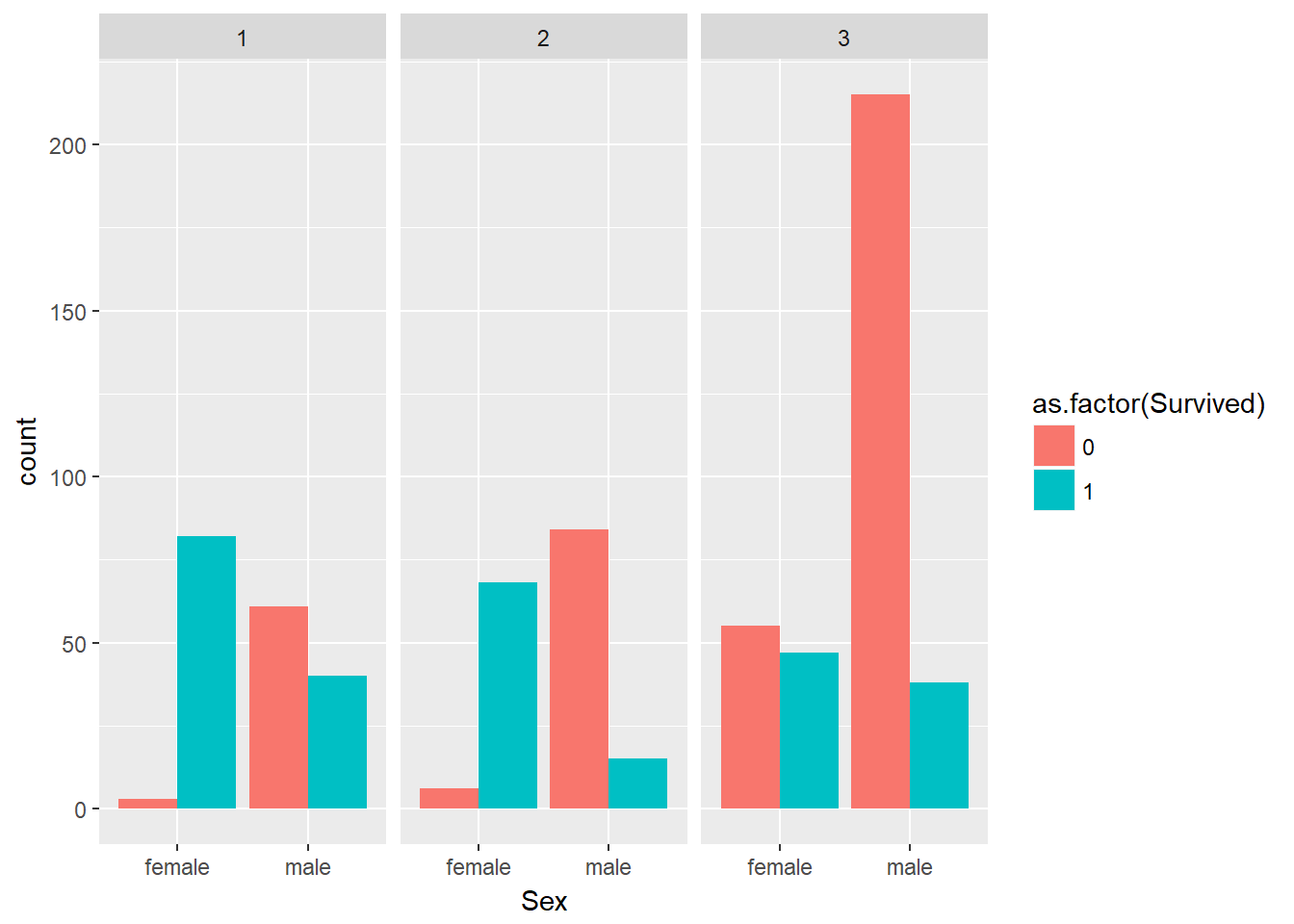
9.6 Further Customisation
Once the broad layout of your figure is settled on you can start to customise the more minor details of the figure to get it ready for publication. This includes things like changing labels, adding titles, fixing up the legend, adding themes and so on.
First, lets take a look at themes. Themes are a quick and easy way to make some big stylistic changes to a figure, and they just require adding on of ggplot2’s theme_*() layers.
ggplot(data = titanic_clean,
       aes(x = Sex,
           fill = as.factor(Survived))) +
  geom_bar(position = "dodge") +
  facet_grid(~ Pclass) +
  theme_bw()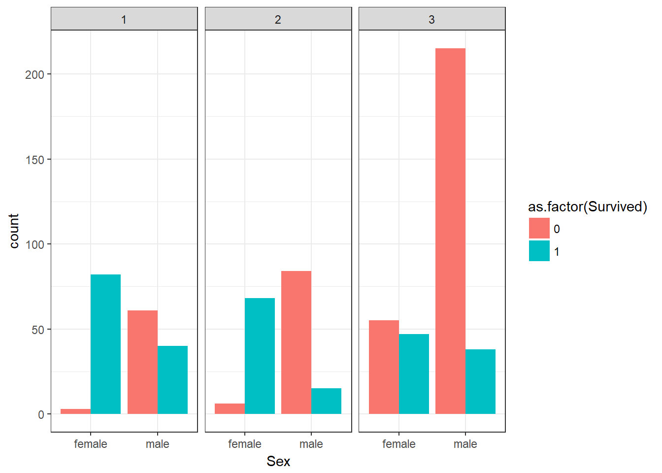
Now lets add some more information (like units!) to our axis labels as well as a title. This involves a mix of the xlab(), ylab(), and ggtitle() functions.
ggplot(data = titanic_clean,
       aes(x = Sex,
           fill = as.factor(Survived))) +
  geom_bar(position = "dodge") +
  facet_grid(~ Pclass) +
  theme_bw() +
  xlab("Passenger age (in years)") +
  ylab("Number of passengers survived") +
  ggtitle("Titanic passenger survival rates")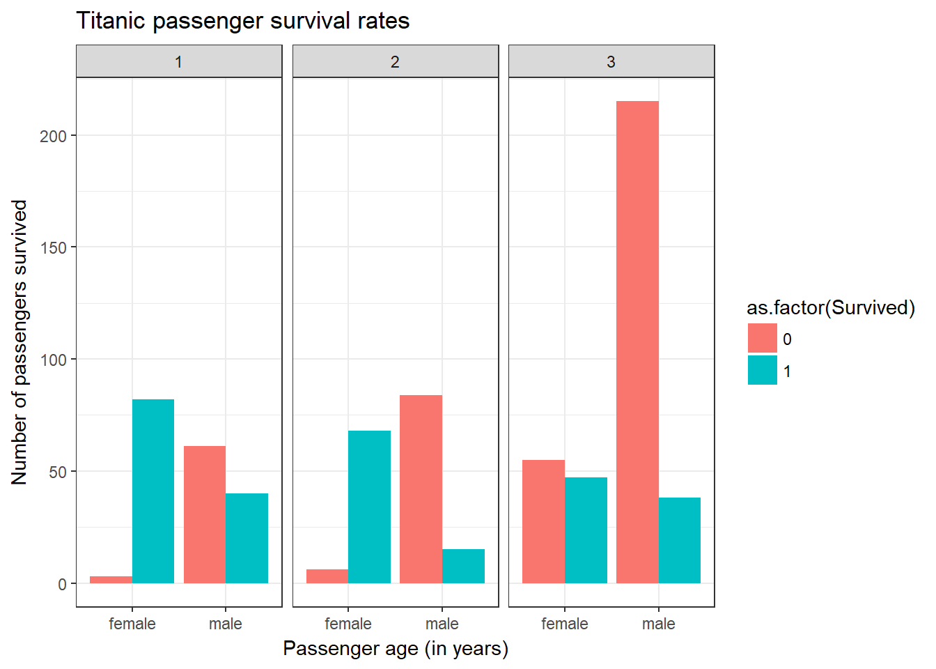
Now lets clean up our facets so that they read “First class” etc instead of just the numeric data they are stored as. This requires the labeller argument and labeller() function inside our facet_grid() call:
To clean this figure up for a publication we need to change some of the text elements.
We can do this by adding a couple of different layers. The theme layer controls the axis text, and overall text size, and there are special layers for changing the axis labels. To change the legend title, we need to use the scales layer.
ggplot(data = titanic_clean,
       aes(x = Sex,
           fill = as.factor(Survived))) +
  geom_bar(position = "dodge") +
  facet_grid(~ Pclass,
             labeller = labeller(Pclass = c(`1` = "First Class",
                                                      `2` = "Second Class",
                                                      `3` = "Third Class"))) +
  theme_bw() +
  xlab("Passenger age (in years)") +
  ylab("Number of passengers survived") +
  ggtitle("Titanic passenger survival rates")
And now lets tidy up the legend. How this is done will depend on the type of data being plotted, but it will be one of the various scale_*() functions. In our case we use scale_fill_discrete() since we have discrete data where the colour is filled by this third variable.
ggplot(data = titanic_clean,
       aes(x = Sex,
           fill = as.factor(Survived))) +
  geom_bar(position = "dodge") +
  facet_grid(~ Pclass,
             labeller = labeller(Pclass = c(`1` = "First Class",
                                                      `2` = "Second Class",
                                                      `3` = "Third Class"))) +
  theme_bw() +
  xlab("Passenger age (in years)") +
  ylab("Number of passengers survived") +
  ggtitle("Titanic passenger survival rates") +
  scale_fill_discrete(name = "Survival",
                      label = c("Died", "Survived"))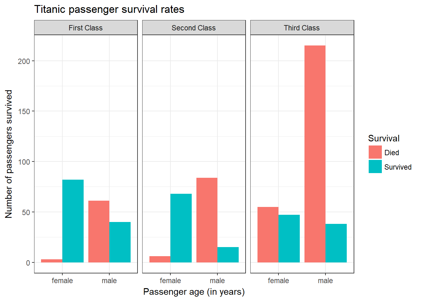
9.7 Saving Plots
Once you have a finished plot you will want to save it to file from R so that you can embed it in your document of choice. The easiest option is to use the ggsave() function that by default saves the last plot from your Plot tab to file using the current size of the graphics device, but you can set your own height, width, and units arguments.
ggsave("images/My_Plot.jpg")

ggsave("images/My_Plot.jpg",
       height = 10,
       width = 15,
       units = "cm")
An alternative is to use one of the variety of image file creation functions available in R like png(), jpeg(), or pdf(). These functions will open a new file of that specific type, add to it anything that you plot, and then needs to be specifically told to close and save the file using the dev.off() function. This is the ideal method of doing so since it gives you greater control over the file generation process, including the ability to save multiple plots to a single file (depending on file type chosen). Unless you have a very good reason why not to, always use the pdf() function here for plots since it saves as a vector graphic so it can be rescaled in the future without pixellation problems.
pdf("images/My_Plot.pdf",
    width = 10,
    height = 6)

ggplot(data = titanic_clean,
       aes(x = Sex,
           fill = as.factor(Survived))) +
  geom_bar(position = "dodge") +
  facet_grid(~ Pclass,
             labeller = labeller(Pclass = c(`1` = "First Class",
                                                      `2` = "Second Class",
                                                      `3` = "Third Class"))) +
  theme_bw() +
  xlab("Passenger age (in years)") +
  ylab("Number of passengers survived") +
  ggtitle("Titanic passenger survival rates") +
  scale_fill_discrete(name = "Survival",
                      label = c("Died", "Survived"))

dev.off()
Alternatively if you have saved your plot in your environment as the variable my_plot:
pdf("images/My_Plot.pdf",
    width = 10,
    height = 6)

my_plot

dev.off()
####################
### Challenge 19 ###
####################
# This is the final challenge of the course and the ONLY assessed component.
#
# Plot the titanic_clean dataset in any way you wish. Customise the plot to your heart's content! If you're lacking inspiration try some of these:
#
# - Change the variables on the axis
# - Change line/point widths/clours/transparency
# - Change the title and axis labels
# - Use a theme!
# - Facet the data
# - Change the colours!
#
# If you have ideas and don't know how to do it ask a helper!
#
# Save the plot to a pdf file in your images/ directory
#
# Show the plot in the file to a helper to get a tick next to your name on the assessment list. We don't care what it looks like as long as the pdf has a plot in it! Make it as pretty or ugly as you wish!